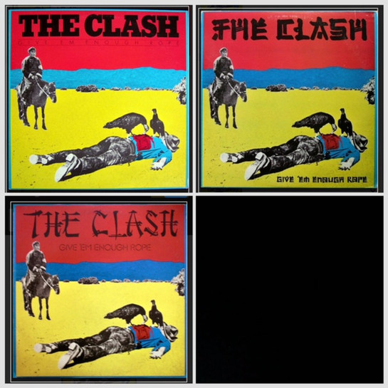
The Clash - Give Em Enough Rope - Released: Nov 10, 1978 -
This is their Sophomore Album.
The cover is based on a postcard titled, "The End of the Trail" by Adrian Atwater, which is based on the painting, "The End of the Trail for Capitalism" by Hugh Brown.
The Graphic Designer, Gen Greif is credited with the Album Cover. He worked and album covers for many artist, including but not limited to, Phoebe Snow, Lonnie Liston Smith, Flash and The Pan, Trillion, Bullseye, and The B-52's.
The controversy with this album is the font used for the band name. It was patented by The Cleveland Type Foundry in 1883 and they patented it as the Chinese font. In the 50's, it was dubbed the Mandarin font and has had many variations and names including, the wonton font, the chopstick font, and the chop suey font (my personal favorite).
When I compiled the list of records for this series, this album came up a few times, but there was very little concrete evidence to validate the story. So you'll have to take this with a grain of salt.
When it was released the jacket had the chop suey font in every country but the U.S. In the U.S, the first press had the block letter font, then the rough chop suey font, then the more stylized one available everywhere else.
The argument is that, at the time, the record company didn't want to offend anyone with the font so they changed it to the block letter. Personally, I find this hard to believe that a record company would care about this release in 1978. That was a mere 30 years after the internment camps of WWII and the sentiment of Asian Americans hadn't changed much in that time. The argument is that Nixon had opened up trading with China and they didn't want to rock the boat. This would have been so beyond unimportant to anyone of importance, IMO.
But there you have it.
Thank you and happy digging.

